Challenge
The project was triggered after collecting very similar feature requests from multiple customers: restricting communication between a specific user type, keeping the thread “private”. A first analysis on the status of the commenting feature highlighted that multiple issues and incorrect interactions were hindering the usability and the experience.
At the same time, the little business focus on this feature turned into low maintenance and misalignment throughout the platform.
Through user research and data analysis, I created a business case that convinced the management to invest in the commenting feature.
Goals
Review & improve pattern usability
Design a scalable and flexible pattern for the entire platform, easily adjustable to the needs of various cases
Example: “read-only” mode
Brainstorm future improvements and design the pattern to easily expand
Example: text formatting tools and attachments upload
Design review
After analysing both usage data and older customers’ requests and researching on best practices, I collected a list of pitfalls and opportunities for improvement. Below a short list with some examples.
Missing hint on an edited comment
After the comment author edited the content, the other users were not made aware that changes applied. Important information could be missed leading to mistakes and misunderstanding.
UI not supporting the actual behaviour
Despite the user being able to reply only to the original message and not to an existing reply, a “Reply” button was added to each comment.
Low accessibility to user’s actions
The existing design system guidelines which included states, accessibility and hierarchy for buttons were not used in the comment pattern. Users were not always able to recognise the actions present (e.g. delete or edit a comment).
Poor margins and alignment
The comments section felt cluttered with unclear division between messages and actions, which made it difficult to understand the relationship between components and to recognise different commenting threads. A longer amount of messages was often difficult to digest.
Final Design
On top of solving the highlighted issues, some features were added to improve the overall usability and experience while driving an increased usage and new opportunities for the user to communicate.

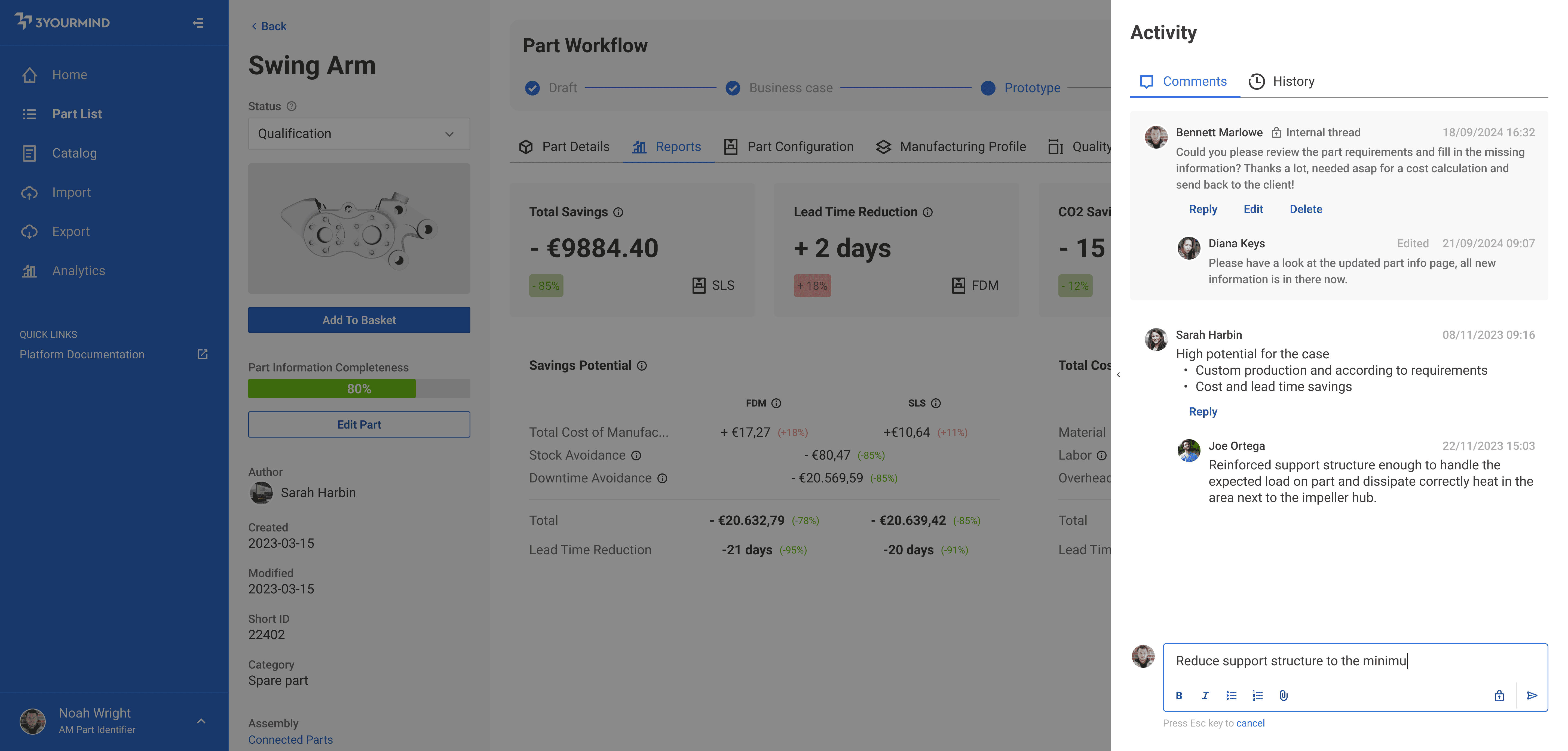
Pattern example containing both type of threads
Retain partial comments
Allow the user to copy&paste content from the application itself or from different sources while saving temporarily the content and status of the comment. Reduce frustration and information loss.
Cancel the changes
Thanks to a clear “Cancel” action and its shortcut accessible while typing the comment, the user could easily revert the content to the previous state, avoiding unintentional misclicks as it was in the past.
Improved accessibility
Correct tabbing design and introduced shortcuts allowed the user to navigate the whole comment pattern with the keyboard, focusing on efficiency and affordability.
Introduce private threads
A darker background colour and a clear icon highlighted this different type of thread, to allow specific users to communicate via the software in a safe way without the external buyer viewing an internal communication.
Tools bar added to the text field
The concept of a toolbar was introduced at the bottom of the text field to easily allow in the future adding tools such as text formatting or attachments upload.
Deliverables
User stories and implementation guidelines for the development team